
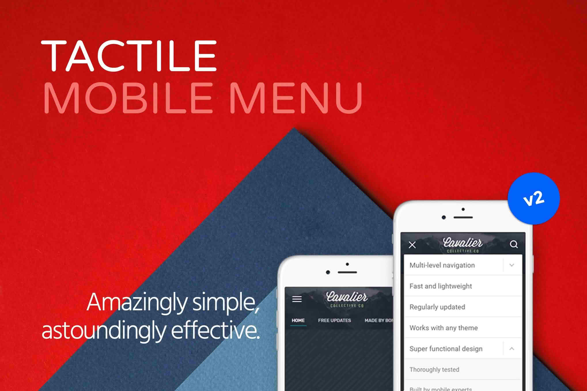
In today’s mobile-first web environment, your navigation menu is the most critical component of your user experience. Tactile: WordPress Mobile Menu transforms your site’s navigation into a sleek, app-like experience designed specifically for touchscreens. By replacing clunky, desktop-oriented menus with a streamlined, thumb-friendly interface, you reduce bounce rates, improve site accessibility, and ensure that your visitors can find exactly what they are looking for without frustration.
Key Features
- App-Like Navigation Experience: Provide your mobile users with a familiar, high-performance interface that feels native to their device rather than a shrunken version of your desktop site.
- Thumb-Friendly Design: Strategically position navigation elements to align with natural thumb movement, making it effortless for users to explore your content while holding their phones with one hand.
- Customizable Layouts: Tailor the menu appearance to match your brand identity, ensuring a cohesive look and feel across all devices.
- Smooth Animations: Utilize fluid transitions and responsive interactions that make navigating through complex site structures feel fast and intuitive.
- Deep Integration: Designed to work harmoniously with existing WordPress themes, ensuring that your site’s core functionality remains intact while upgrading the mobile interface.
- Performance Optimized: Built with a focus on speed, the plugin ensures that your mobile navigation loads quickly, contributing to better Core Web Vitals and overall site performance.
Use Cases / Who It’s For
Tactile is an essential tool for any website owner who prioritizes mobile traffic. If your analytics show a high percentage of visitors coming from smartphones, this plugin is designed to help you capture and retain those users.
For e-commerce store owners, Tactile is a game-changer. By simplifying the path to product categories and search functions, you remove friction from the shopping journey, directly impacting conversion rates. If a customer cannot find your products easily on their phone, they will likely leave; Tactile ensures your catalog is always just a tap away.
For content creators, bloggers, and news sites, the plugin helps manage complex site structures. When you have a vast archive of articles, a standard mobile menu can become an overwhelming list. Tactile helps organize this content into a clean, hierarchical structure, allowing readers to dive deeper into your site without getting lost.
Ultimately, this plugin is for anyone who understands that a desktop-first approach to mobile design is no longer sufficient. If you want to project a professional, modern image and provide a seamless browsing experience, Tactile provides the infrastructure to achieve that.
Setup / How It Works
Getting started with Tactile is designed to be straightforward, allowing you to upgrade your mobile navigation without needing advanced coding skills.
- Installation: Upload and activate the plugin through your WordPress dashboard just as you would with any other standard plugin.
- Configuration: Navigate to the plugin settings panel to define your menu structure. You can map your existing WordPress menus to the Tactile interface.
- Customization: Use the intuitive settings interface to adjust colors, icons, and layout preferences to align with your site’s branding.
- Preview and Launch: Use the mobile preview tools to verify how the menu appears on different screen sizes, then save your settings to make the new navigation live for your mobile visitors.
Similar Plugins
If you are exploring options for mobile navigation, you may also encounter alternatives such as WP Mobile Menu or Max Mega Menu. While these plugins offer various ways to handle mobile navigation, Tactile distinguishes itself through its specific focus on an app-like, touch-optimized user experience that prioritizes ease of use for the end visitor.